Smoke and Shadow Library Edition
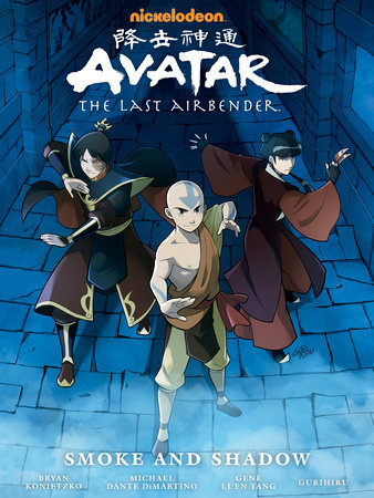
Written By: Gene Yang
Art By: Team Gurihiru
Letters By: Michael Heisler
Published By: Dark Horse Comics
Release Dates: September 21st in comic stores, October 4th elsewhere.
It is Hardcover time, this time out Smoke and Shadow has been collected in Hardcover or Library Edition format. As ever this means that the 3 individual part of Smoke and Shadow are collected into a big hardcover book with a new cover, some concept art extras and commentary/annotations to accompany the story itself. Nothing new compared to the previous 3 Library Editions, the quality of the book in person is great and looks fantastic next to my other Library Editions and Avatar/Korra art books, Dark Horse really do a great job at putting these big hardcovers together.
As ever I will not go too in-depth on the story since I have previously reviewed each individual part when they initially came out. Smoke and Shadow is a return to the Fire Nation, it acts as a sequel to The Search, with much of the plot continuing arcs set up there with Ursa, Azula and Zuko, but other plots within the book reference The Promise as well as the "Rebound" free comic from a few years ago. This is an intense political thriller as a group called The New Ozai Society led by Mai's father aim to remove Zuko as Fire Lord upon his return. We get a lot of interesting Mai and Zuko interactions, Ty Lee and Suki get some moments to shine and Ursa struggles with her return to the nation she left in dramatic fashion all those years ago. I really enjoy the story of Smoke and Shadow, the character interactions are spot on, the only let down is that it is our first comic series where a lot of the arcs are set up for stuff still to happen when we are so used to each comic resolving all of its arcs within the series. This is a series that will go up or down depending on where those unresolved arcs go in the future.
[caption id="attachment_10098" align="aligncenter" width="375"]
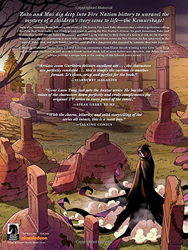
The back cover.[/caption]
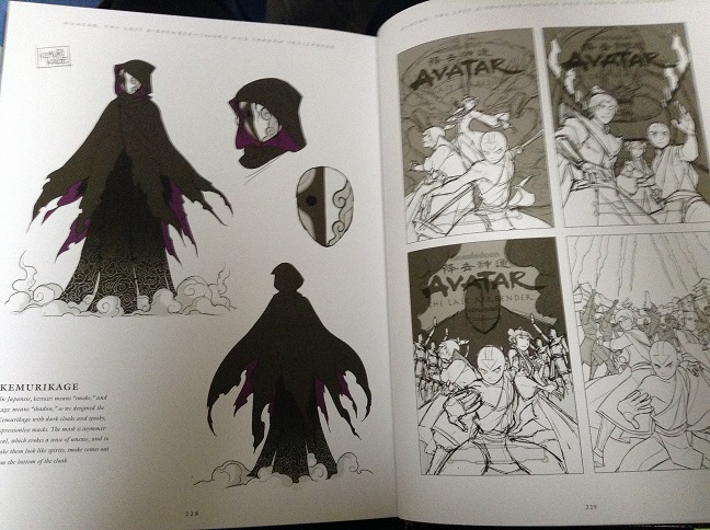
As for the book itself. We get 10 pages of Concept Art extras, which as usual show us the various stages and iterations of the covers for the individual parts as well as the hardcover cover. There are a few character designs focusing on Kei Lo, Ukano, The New Ozai Society and the Kemurikage. Solid, but uninspiring compared to the concept art sections from the other books. I feel like they need to do more with the extras going forward, maybe have Gurihiru talk more in text about the new elements for the series or the tricky sections of the book. The art extras feel very by the numbers this time, as if they are putting them in only because they have done it before.

Unfortunately I feel very similarly about the annotations. The last 2 hardcovers I have been very harsh on and at this stage I have just accepted that these annotations are never going to give us what we actually want. This time out 60 of the 216 story pages have annotations, the most out of all of the hardcovers (58 in The Promise, 51 in The Search, only 36 for The Rift). The problem is that about half of the pages that do have annotations are just one line comments with no substance to them, these annotations suffer from the same problem they have always suffered from, pointing out the obvious and being too simplistic. Is the point of these not to add an extra layer to the story you are reading as a fan who has bought this special edition collection of the comic I know that Fire Sage Shyu was in the show, I know we have seen the Dragonbone catacombs before. Why don't you give me more insight into the Warlords/Fire Fire Lord backstory, the direction they took Kei Lo in towards the end of the series, why what Azula was doing prior to this is not explained, extra insight into Mai and Zuko's relationship at this point in time. It is so frustrating to see this be a regular feature in these big books and see them used so badly. Like I have said many times before, it looks really bad when you have laid out the book with the big gaps on the sides of ALL of the pages for annotations and less than 33% of the pages have annotations, it means more than 160 pages of this book has a huge blank border there for no reason. I really wish they would just scrap the annotations and make the art for the pages the full size of the hardcover and then have a text interview with Gene Yang and Gurihiru about the series.
[caption id="attachment_10100" align="aligncenter" width="484"]
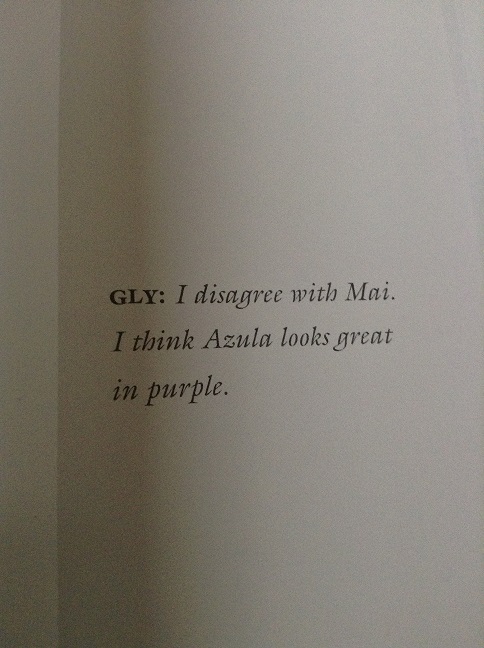
Annotations like these highlight the overall issue. This is all that the writer has to say about a really big moment between Azula and Mai, nothing of note to say at all about a pretty important meeting of former friends. So many other big moments are given a similar treatment.[/caption]
For me only 3 of the annotation comments stood out as interesting. One seemed to tease something more to Kei Lo as a character, though it was very vague, another confirmed that Azula was in-fact redirecting lightning during her initial conflict with Zuko in this series, the other was an interesting note from Gene about the planning of this story with Mike and Bryan. The rest of the comments are mainly what his inspiration for some story and art decisions were. So many of them just feel so skipable, you get nothing of interesting out of what is being said.
Please don't get me wrong, I really like this book. The extras are just that, extras, they are a small part of what this book is. I buy these hardcover editions because the quality of the book is so high and they really stand out in a collection, the extras are a cool extra incentive to give you something new, but I definitely would not recommend buying this book solely for those extras. Buy this book if you, like me, already own the previous 3 Library Editions or if you have not bought the 3 individual parts of Smoke and Shadow. This is the superior version of the series and now that it is out I recommend this over the 3 parts.
If you want a more visual review, check out my video review
https://www.youtube.com/watch?v=0uMokBUH470 Written By: Gene Yang
Art By: Team Gurihiru
Letters By: Michael Heisler
Published By: Dark Horse Comics
Release Dates: September 21st in comic stores, October 4th elsewhere.
It is Hardcover time, this time out Smoke and Shadow has been collected in Hardcover or Library Edition format. As ever this means that the 3 individual part of Smoke and Shadow are collected into a big hardcover book with a new cover, some concept art extras and commentary/annotations to accompany the story itself. Nothing new compared to the previous 3 Library Editions, the quality of the book in person is great and looks fantastic next to my other Library Editions and Avatar/Korra art books, Dark Horse really do a great job at putting these big hardcovers together.
As ever I will not go too in-depth on the story since I have previously reviewed each individual part when they initially came out. Smoke and Shadow is a return to the Fire Nation, it acts as a sequel to The Search, with much of the plot continuing arcs set up there with Ursa, Azula and Zuko, but other plots within the book reference The Promise as well as the "Rebound" free comic from a few years ago. This is an intense political thriller as a group called The New Ozai Society led by Mai's father aim to remove Zuko as Fire Lord upon his return. We get a lot of interesting Mai and Zuko interactions, Ty Lee and Suki get some moments to shine and Ursa struggles with her return to the nation she left in dramatic fashion all those years ago. I really enjoy the story of Smoke and Shadow, the character interactions are spot on, the only let down is that it is our first comic series where a lot of the arcs are set up for stuff still to happen when we are so used to each comic resolving all of its arcs within the series. This is a series that will go up or down depending on where those unresolved arcs go in the future.
[caption id="attachment_10098" align="aligncenter" width="375"]
 The back cover.[/caption]
As for the book itself. We get 10 pages of Concept Art extras, which as usual show us the various stages and iterations of the covers for the individual parts as well as the hardcover cover. There are a few character designs focusing on Kei Lo, Ukano, The New Ozai Society and the Kemurikage. Solid, but uninspiring compared to the concept art sections from the other books. I feel like they need to do more with the extras going forward, maybe have Gurihiru talk more in text about the new elements for the series or the tricky sections of the book. The art extras feel very by the numbers this time, as if they are putting them in only because they have done it before.
Unfortunately I feel very similarly about the annotations. The last 2 hardcovers I have been very harsh on and at this stage I have just accepted that these annotations are never going to give us what we actually want. This time out 60 of the 216 story pages have annotations, the most out of all of the hardcovers (58 in The Promise, 51 in The Search, only 36 for The Rift). The problem is that about half of the pages that do have annotations are just one line comments with no substance to them, these annotations suffer from the same problem they have always suffered from, pointing out the obvious and being too simplistic. Is the point of these not to add an extra layer to the story you are reading as a fan who has bought this special edition collection of the comic I know that Fire Sage Shyu was in the show, I know we have seen the Dragonbone catacombs before. Why don't you give me more insight into the Warlords/Fire Fire Lord backstory, the direction they took Kei Lo in towards the end of the series, why what Azula was doing prior to this is not explained, extra insight into Mai and Zuko's relationship at this point in time. It is so frustrating to see this be a regular feature in these big books and see them used so badly. Like I have said many times before, it looks really bad when you have laid out the book with the big gaps on the sides of ALL of the pages for annotations and less than 33% of the pages have annotations, it means more than 160 pages of this book has a huge blank border there for no reason. I really wish they would just scrap the annotations and make the art for the pages the full size of the hardcover and then have a text interview with Gene Yang and Gurihiru about the series.
[caption id="attachment_10100" align="aligncenter" width="484"]
 Annotations like these highlight the overall issue. This is all that the writer has to say about a really big moment between Azula and Mai, nothing of note to say at all about a pretty important meeting of former friends. So many other big moments are given a similar treatment.[/caption]
For me only 3 of the annotation comments stood out as interesting. One seemed to tease something more to Kei Lo as a character, though it was very vague, another confirmed that Azula was in-fact redirecting lightning during her initial conflict with Zuko in this series, the other was an interesting note from Gene about the planning of this story with Mike and Bryan. The rest of the comments are mainly what his inspiration for some story and art decisions were. So many of them just feel so skipable, you get nothing of interesting out of what is being said.
Please don't get me wrong, I really like this book. The extras are just that, extras, they are a small part of what this book is. I buy these hardcover editions because the quality of the book is so high and they really stand out in a collection, the extras are a cool extra incentive to give you something new, but I definitely would not recommend buying this book solely for those extras. Buy this book if you, like me, already own the previous 3 Library Editions or if you have not bought the 3 individual parts of Smoke and Shadow. This is the superior version of the series and now that it is out I recommend this over the 3 parts.
If you want a more visual review, check out my video review
https://www.youtube.com/watch?v=0uMokBUH470
