Once again I am delayed in getting an Art Book Review out, again the reason is that nowhere had the book on day of release and I had to order online, but at last I have the book and am ready to review it.
The Legend Of Korra Book 3 Change - Art Of The Animated Series
Written by: Michael Dante DiMartino, Bryan Konietzko and Joaquim Dos Santos
Published by: Dark Horse
Edited by: Dave Marshall
Designed by: Stephen Reichert
Art by: A lot of people
We will start as usual with a comparison to the other art books. Like the ATLA and Korra Book 2 Art Book this book is 184 pages in length, the Book 1 Air Art Book is 40 less at 144 pages long and because Book 3 Change is 13 episodes long that means this book has the highest pages per episode count of any Art Book so far.
[caption id="attachment_9444" align="aligncenter" width="600"]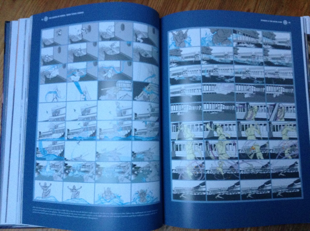 The book has a few too many pages like this. Double page spreads and full pages to show storyboards. They are still interesting, but for me some of the least interesting pieces of art in these art books, each individual frame ends up being so small you cannot really make out the incredible detail that some of the larger pieces show.[/caption]
In the Book 2 Art Book I praised the extra 40 pages, as they allowed such a visually interesting book to really showcase everything it had. With Book 3 while there are definitely a lot of great visual elements, it is not as visually strong as Book 2, so those 40 extra pages here primarily go towards a lot more storyboards, which for me are some of the least interesting pages in the art books. Looking back at the ATLA art book, there were only a select few pages showing storyboards, but in this art book there are multiple storyboard pages per chapter. My issue is that these art books are great because they are big books that allow a lot of space to show the art clearly, but with the storyboards they just show a whole scene via a lot of tiny storyboards that even in a big book like this is not very clear. Especially with this book having so many, it does become a bit of a problem, given the lack of attention other aspects get.
Another issue I have is that the characters are not really focused on too much, I have said the same about all of the Art Books so far, there is not enough text descriptions of the art shown in these Korra Art Books. Too often a key character introduced in a book gets just 1 image of their finished design and a few head turns with a 1 line annotation telling us that the images we see are a few head turns and the finished design, barely anything is said about the development of the characters. Earth Queen Hou Ting is a good example, she has a decent sized role in this book, yet all she gets in this book is 4 little images taking up about 1/6th of 1 page and very little said about her in the text. Ultimately the problem is that way too much of the text is just pointing out the obvious, there are only a few times where these annotations of pieces of text reveal anything of note.
[caption id="attachment_9445" align="aligncenter" width="600"]
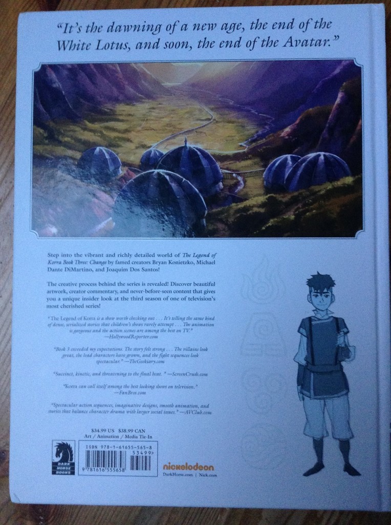 The back cover, featuring a quote from Zaheer, Zaofu and Kai.[/caption]
Some of the new things revealed are the names of the head barbarian that Korra and Asami fight, Gombo as well as the name of the main Bison Hunter from K307, Ganbat. Confirmation that it is not Zaheer in Suyin's picture of herself in the circus as well as confirmation of the ages of Suyin, Lin and Toph from the flashbacks which allow us to calculate that Toph had Lin when she was 31 and Suyin when she was 37. As ever if all you are interested from in this book is new canon facts like these, then this book is probably not for you, there are a good few interesting things throughout, but on the whole the focus is naturally on the art rather than revealing new information.
[caption id="attachment_9442" align="aligncenter" width="600"]
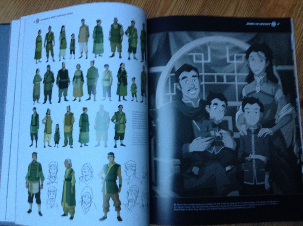 These pages show the strength of the Book 3 Art Book. On the left we get a good look at all of Mako and Bolin's family and on the right a full page shot of Mako and Bolin's family photo with their Father, San and mother, Naoki.[/caption]
One of the biggest strengths of this Art Book in particular is a huge focus throughout on showcasing the designs of the massive amount of background characters. From all 3 rings of Ba Sing Se, citizens of the various towns they visit, all the different barbarian/bandit designs all the way down to all of the unnamed Air Benders characters. It is really cool to see just how unique all of these background characters are, none of them look the same and barely any of them are really seen all that clearly in the show, it really shows how much detail and effort goes into this show that the designers have to take time to make every single character shown in the show ever look unique and different. These pages throughout the chapters are my favourites from the book.
Of course the locations get the prime focus here and as ever are gorgeous, the 2 page spreads featuring a big background image to start each new chapter remain some of my favourites in the book. Each 2 page spread a a background painting of a location important to the episode the chapter is on. The locations get a lot more focus in the chapters too, showing the development of each location well. I do have to say, that going into this book I was excited to see the pages on Zaofu as that city is gorgeous, but I was a bit disappointed that it only really got a page or two in the book and felt a little bit glossed over. On the flip side we get some great pages showing Ba Sing Se now 70 years on from when we last saw it in ATLA.
Overall, I would have to say that out of the 4 art books we now have for Avatar this is definitely the weakest of the 4. It is not bad, but when I finished reading I was a little let down by what the book devoted time to and didn't devote time to. As always the art throughout the whole book is stunning and interesting, if you are a huge fan of this show's art style then I am confident you will enjoy this book, but it lacked the impact that the Book 1 Air book had with the focus on how the main characters were developed and the new show info that it had, it lacked the stunning spirit focus that the Book 2 Spirits book had which made that book one of the prettiest books I have ever read. I hope that the Book 4 Balance Art Book, which will complete the collection will be a return to form, the main improvement I want to see is more text describing and giving detail to the art and more of a focus on what we as fans really connect to, the characters. To often in this book, the characters felt like they were the lowest priority when it came to choosing what to devote page space to, when they are arguably the greatest strength of Korra as a series.
In short definitely add this book to your collection, especially if you have the previous 3 art books, but don't feel the need to rush out to get this one, I would definitely prioritise The Rift Library Edition, which is out Wednesday February 11th, over this book if you can only get one of these big books. That is a must read comic and the Library edition is THE way to read it, this Book 3 Change Art Book is definitely a worthy addition to any Avatar Fans Merchandise collection, but it is more of a "check it out when you can" rather than a "GET IT NOW!" book.
The book is available online, in stores and digitally from Dark Horse Digital. The retail price is $34.99.
If you want a more visual review of the book, check out my video review on youtube
http://youtu.be/Z6_aFaCDv0w
 The book has a few too many pages like this. Double page spreads and full pages to show storyboards. They are still interesting, but for me some of the least interesting pieces of art in these art books, each individual frame ends up being so small you cannot really make out the incredible detail that some of the larger pieces show.[/caption]
In the Book 2 Art Book I praised the extra 40 pages, as they allowed such a visually interesting book to really showcase everything it had. With Book 3 while there are definitely a lot of great visual elements, it is not as visually strong as Book 2, so those 40 extra pages here primarily go towards a lot more storyboards, which for me are some of the least interesting pages in the art books. Looking back at the ATLA art book, there were only a select few pages showing storyboards, but in this art book there are multiple storyboard pages per chapter. My issue is that these art books are great because they are big books that allow a lot of space to show the art clearly, but with the storyboards they just show a whole scene via a lot of tiny storyboards that even in a big book like this is not very clear. Especially with this book having so many, it does become a bit of a problem, given the lack of attention other aspects get.
Another issue I have is that the characters are not really focused on too much, I have said the same about all of the Art Books so far, there is not enough text descriptions of the art shown in these Korra Art Books. Too often a key character introduced in a book gets just 1 image of their finished design and a few head turns with a 1 line annotation telling us that the images we see are a few head turns and the finished design, barely anything is said about the development of the characters. Earth Queen Hou Ting is a good example, she has a decent sized role in this book, yet all she gets in this book is 4 little images taking up about 1/6th of 1 page and very little said about her in the text. Ultimately the problem is that way too much of the text is just pointing out the obvious, there are only a few times where these annotations of pieces of text reveal anything of note.
[caption id="attachment_9445" align="aligncenter" width="600"]
 The back cover, featuring a quote from Zaheer, Zaofu and Kai.[/caption]
Some of the new things revealed are the names of the head barbarian that Korra and Asami fight, Gombo as well as the name of the main Bison Hunter from K307, Ganbat. Confirmation that it is not Zaheer in Suyin's picture of herself in the circus as well as confirmation of the ages of Suyin, Lin and Toph from the flashbacks which allow us to calculate that Toph had Lin when she was 31 and Suyin when she was 37. As ever if all you are interested from in this book is new canon facts like these, then this book is probably not for you, there are a good few interesting things throughout, but on the whole the focus is naturally on the art rather than revealing new information.
[caption id="attachment_9442" align="aligncenter" width="600"]
 These pages show the strength of the Book 3 Art Book. On the left we get a good look at all of Mako and Bolin's family and on the right a full page shot of Mako and Bolin's family photo with their Father, San and mother, Naoki.[/caption]
One of the biggest strengths of this Art Book in particular is a huge focus throughout on showcasing the designs of the massive amount of background characters. From all 3 rings of Ba Sing Se, citizens of the various towns they visit, all the different barbarian/bandit designs all the way down to all of the unnamed Air Benders characters. It is really cool to see just how unique all of these background characters are, none of them look the same and barely any of them are really seen all that clearly in the show, it really shows how much detail and effort goes into this show that the designers have to take time to make every single character shown in the show ever look unique and different. These pages throughout the chapters are my favourites from the book.
Of course the locations get the prime focus here and as ever are gorgeous, the 2 page spreads featuring a big background image to start each new chapter remain some of my favourites in the book. Each 2 page spread a a background painting of a location important to the episode the chapter is on. The locations get a lot more focus in the chapters too, showing the development of each location well. I do have to say, that going into this book I was excited to see the pages on Zaofu as that city is gorgeous, but I was a bit disappointed that it only really got a page or two in the book and felt a little bit glossed over. On the flip side we get some great pages showing Ba Sing Se now 70 years on from when we last saw it in ATLA.
Overall, I would have to say that out of the 4 art books we now have for Avatar this is definitely the weakest of the 4. It is not bad, but when I finished reading I was a little let down by what the book devoted time to and didn't devote time to. As always the art throughout the whole book is stunning and interesting, if you are a huge fan of this show's art style then I am confident you will enjoy this book, but it lacked the impact that the Book 1 Air book had with the focus on how the main characters were developed and the new show info that it had, it lacked the stunning spirit focus that the Book 2 Spirits book had which made that book one of the prettiest books I have ever read. I hope that the Book 4 Balance Art Book, which will complete the collection will be a return to form, the main improvement I want to see is more text describing and giving detail to the art and more of a focus on what we as fans really connect to, the characters. To often in this book, the characters felt like they were the lowest priority when it came to choosing what to devote page space to, when they are arguably the greatest strength of Korra as a series.
In short definitely add this book to your collection, especially if you have the previous 3 art books, but don't feel the need to rush out to get this one, I would definitely prioritise The Rift Library Edition, which is out Wednesday February 11th, over this book if you can only get one of these big books. That is a must read comic and the Library edition is THE way to read it, this Book 3 Change Art Book is definitely a worthy addition to any Avatar Fans Merchandise collection, but it is more of a "check it out when you can" rather than a "GET IT NOW!" book.
The book is available online, in stores and digitally from Dark Horse Digital. The retail price is $34.99.
If you want a more visual review of the book, check out my video review on youtube
http://youtu.be/Z6_aFaCDv0w


